Matplotlib 3次元の折れ線グラフ#
※記事内に商品プロモーションを含むことがあります。
公開日
この記事では、Matplotlibで3次元の折れ線グラフをプロットする方法を解説します。2次元の折れ線グラフについては以下の記事を参照ください。
3次元折れ線グラフの基本#
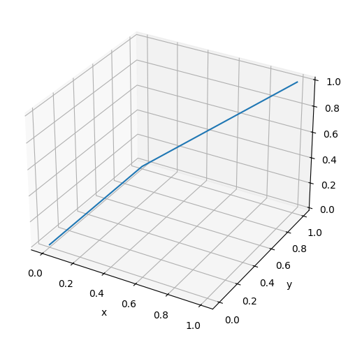
plt.subplots()のsubplot_kwオプションに{'projection': '3d'}という辞書形式データを与えることで、3次元のプロットになります。折れ線グラフをプロットするには、さらにax.plot()メソッドを使います。ax.plot()に曲線が通過する点のx, y, z座標を配列で与えます。
以下の例では、曲線は(x, y, z)=(0 ,0, 0), (0, 1, 0), (1, 1, 1)の3点を通過します。
import matplotlib.pyplot as plt

x = [0, 0, 1]
y = [0, 1, 1]
z = [0, 0, 1]

fig, ax = plt.subplots(figsize=(6, 6), subplot_kw={'projection': '3d'})
ax.plot(x, y, z)
ax.set_xlabel("x")
ax.set_ylabel("y")
ax.set_zlabel("z")
plt.show()
Matplotlibの公式サイトによると、以下のようにplt.figure()とfig.add_subplot()を組み合わせた方法が主流のようです。しかし、このサイトでは2次元のグラフと形式を揃えるため、基本的に上の記述方法で解説します。
fig = plt.figure(figsize=(6, 6))
ax = fig.add_subplot(projection='3d')
ax.plot(x, y, z)
ax.set_xlabel("x")
ax.set_ylabel("y")
ax.set_zlabel("z")
plt.show()
なお、projection='3d'とした場合、axはAxes3DSubplotオブジェクトとなります。
print(type(ax))
<class 'mpl_toolkits.mplot3d.axes3d.Axes3D'>
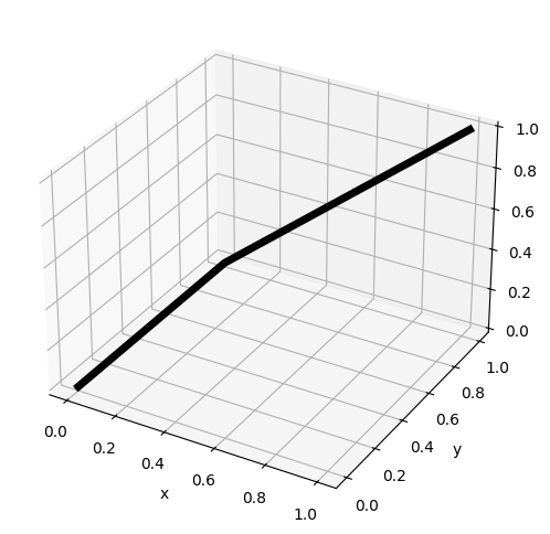
線の太さ・色・種類#
線の太さを変える場合、linewidthオプションで指定します。値が大きいほど、線が太くなります。
また、線の種類と色は、それぞれlinestyle, colorオプションで指定します。
fig, ax = plt.subplots(figsize=(6, 6), subplot_kw={'projection': '3d'})
ax.plot(x, y, z, linewidth=5, color="black")
ax.set_xlabel("x")
ax.set_ylabel("y")
ax.set_zlabel("z")
plt.show()
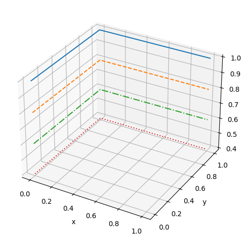
fig, ax = plt.subplots(figsize=(6, 6), subplot_kw={'projection': '3d'})
ax.plot(x, y, [1.0, 1.0, 1.0], linestyle="solid") # 実線(デフォルト)
ax.plot(x, y, [0.8, 0.8, 0.8], linestyle="dashed") # 破線
ax.plot(x, y, [0.6, 0.6, 0.6], linestyle="dashdot") # 一点鎖線
ax.plot(x, y, [0.4, 0.4, 0.4], linestyle="dotted") # 点線
ax.set_xlabel("x")
ax.set_ylabel("y")
ax.set_zlabel("z")
plt.show()
linewidth, linestyleオプションの詳細は以下の記事を参考にして下さい。
また、colorオプションの詳細は以下の記事を参考にして下さい。
マーカーを表示する#
データのマーカーを表示するには、markerオプションを使用します。
fig, ax = plt.subplots(figsize=(6, 6), subplot_kw={'projection': '3d'})
ax.plot(x, y, [1.0, 1.0, 1.0], marker="o")
ax.plot(x, y, [0.8, 0.8, 0.8], marker="v")
ax.plot(x, y, [0.6, 0.6, 0.6], marker="s")
ax.plot(x, y, [0.4, 0.4, 0.4], marker="+")
ax.plot(x, y, [0.2, 0.2, 0.2], marker="o")
ax.plot(x, y, [0.0, 0.0, 0.0], marker="D")
ax.set_xlabel("x")
ax.set_ylabel("y")
ax.set_zlabel("z")
plt.show()
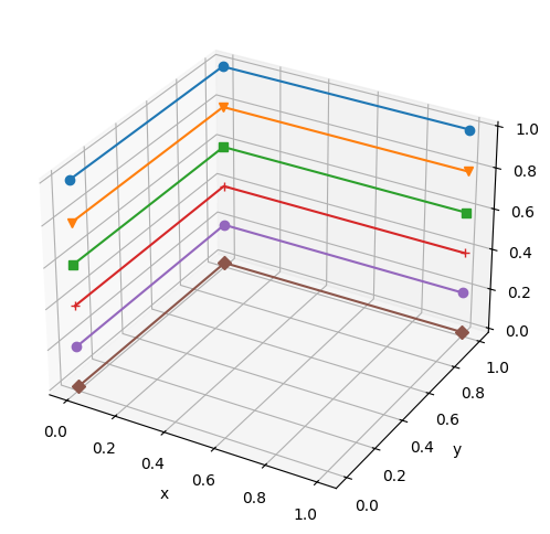
主なmarkerオプションを以下の表に示します。
marker |
説明 |
|---|---|
|
丸 |
|
下向き三角 |
|
上向き三角 |
|
左向き三角 |
|
右向き三角 |
|
四角形(square) |
|
五角形(pentagon) |
|
+記号 |
|
x記号 |
|
ダイヤモンド |
その他に利用可能なマーカーの種類については、以下の公式ページを参照してください。