Matplotlibの折れ線グラフ#
※記事内に商品プロモーションを含むことがあります。
公開日
Matplotlibで折れ線グラフをプロットするには、ax.plotを使用します。ax.plotの簡単な例を以下に示します。
import numpy as np
import matplotlib.pyplot as plt

x = np.array([1, 2, 3, 4]) # 横軸の値
y = np.array([5, 3, 7, 4]) # 縦軸の値

fig, ax = plt.subplots()
ax.plot(x, y)
plt.show()
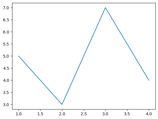
上に示すように、ax.plotの最初の引数は横軸の値、2番目の引数は縦軸の値とします。
複数系列の折れ線グラフ#
折れ線を追加したい場合、以下のように配列のサイズを(横軸の点数)×(折れ線の数)とします。
y2 = np.array([[5, 3],
               [3, 6],
               [7, 2],
               [4, 1]])

fig, ax = plt.subplots()
ax.plot(x, y2)
plt.show()
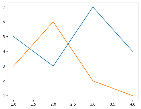
または、以下のようにax.plotを追加することでも線を追加できます。
y3 = np.array([3, 6, 2, 1])

fig, ax = plt.subplots()
ax.plot(x, y)
ax.plot(x, y3)
plt.show()
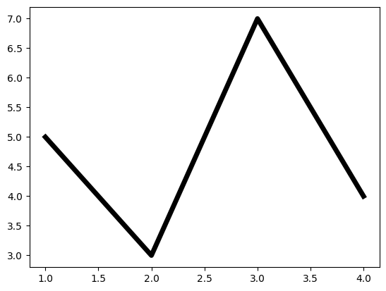
線の太さ・色・種類を変える#
線の太さを変える場合、linewidthオプションで指定します。値が大きいほど、線が太くなります。
また、線の種類と色は、それぞれlinestyle, colorオプションで指定します。
fig, ax = plt.subplots()
ax.plot(x, y, linewidth=5, color="black")
plt.show()
fig, ax = plt.subplots()
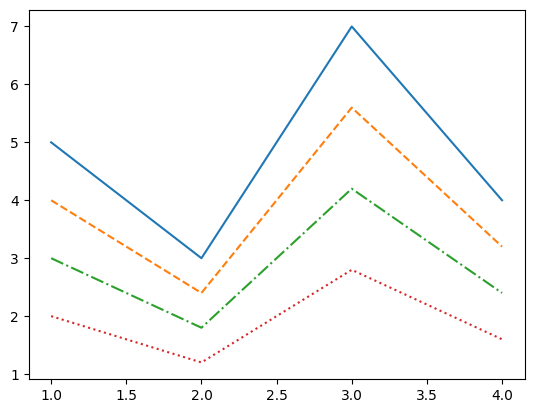
ax.plot(x, y, linestyle="solid") # 実線(デフォルト)
ax.plot(x, 0.8*y, linestyle="dashed") # 破線
ax.plot(x, 0.6*y, linestyle="dashdot") # 一点鎖線
ax.plot(x, 0.4*y, linestyle="dotted") # 点線
plt.show()
linewidth, linestyleオプションの詳細は以下の記事を参考にして下さい。
また、colorオプションの詳細は以下の記事を参考にして下さい。
マーカーを表示する#
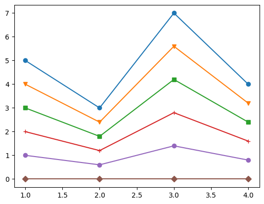
データのマーカーを表示するには、markerオプションを使用します。
fig, ax = plt.subplots()
ax.plot(x, y, marker="o")
ax.plot(x, 0.8*y, marker="v")
ax.plot(x, 0.6*y, marker="s")
ax.plot(x, 0.4*y, marker="+")
ax.plot(x, 0.2*y, marker="o")
ax.plot(x, 0*y, marker="D")
plt.show()
主なmarkerオプションを以下の表に示します。
marker |
説明 |
|---|---|
|
丸 |
|
下向き三角 |
|
上向き三角 |
|
左向き三角 |
|
右向き三角 |
|
四角形(square) |
|
五角形(pentagon) |
|
+記号 |
|
x記号 |
|
ダイヤモンド |
その他に利用可能なマーカーの種類は、以下の公式ページを参照してください。
matplotlib.markers — Matplotlib documentation
マーカーの枠線の太さ・色などは変更できます。指定できるオプションを以下の表に示します。
オプション |
説明 |
|---|---|
markersize |
マーカーの大きさ |
markeredgewidth |
マーカー枠線の太さ |
markeredgecolor |
マーカー枠線の色 |
markerfacecolor |
マーカーの塗潰しの色 |
fillstyle |
マーカーの塗潰しスタイル。 |
markerfacecoloralt |
マーカーの塗潰しの色2。fillstyleで |
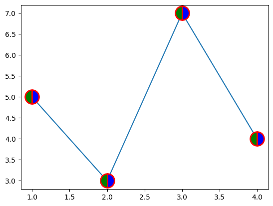
これらのオプションを使用した例を以下に示します。マーカーの枠線が赤、左半分が緑、右半分が青となります。
fig, ax = plt.subplots()
ax.plot(x, y, marker="o", markersize=20, markeredgecolor="red", markeredgewidth=2,
        markerfacecolor="green", fillstyle="left", markerfacecoloralt="blue")
plt.show()