Matplotlibのヒートマップ#
※記事内に商品プロモーションを含むことがあります。
公開日
参考
Seabornを使用してヒートマップを出力する場合、Seabornのヒートマップを参照ください。
Matplotlibでヒートマップを出力するには、ax.pcolorを使用します。ax.pcolorの最初の引数に2次元配列を与えます。
import numpy as np
import matplotlib.pyplot as plt

C = np.arange(50).reshape(5, 10)

fig, ax = plt.subplots()
ax.pcolor(C)
plt.show()
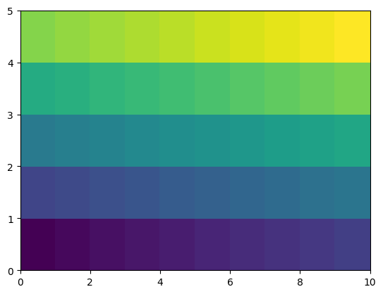
ここで、Cは以下のような5行10列の2次元配列です。ヒートマップも5行10列で出力されています。
C
array([[ 0,  1,  2,  3,  4,  5,  6,  7,  8,  9],
       [10, 11, 12, 13, 14, 15, 16, 17, 18, 19],
       [20, 21, 22, 23, 24, 25, 26, 27, 28, 29],
       [30, 31, 32, 33, 34, 35, 36, 37, 38, 39],
       [40, 41, 42, 43, 44, 45, 46, 47, 48, 49]])
カラーマップの指定#
cmapオプションでカラーマップを指定します。
fig, ax = plt.subplots()
ax.pcolor(C, cmap="Reds")
plt.show()
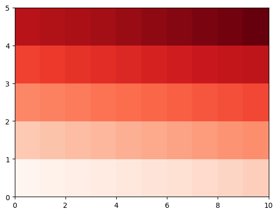
指定可能なカラーマップについては、以下のページも参照下さい。
カラーバーを表示する場合、plt.colorbarを使用します。ax.pcolorの戻り値はPolyCollectionというクラスのオブジェクトです。これをplt.colorbarの最初の引数とします。また、axオプションにカラーバーを表示するグラフ(ここではax)を指定します。
fig, ax = plt.subplots()
mappable = ax.pcolor(C, cmap="Reds")
plt.colorbar(mappable, ax=ax)
plt.show()
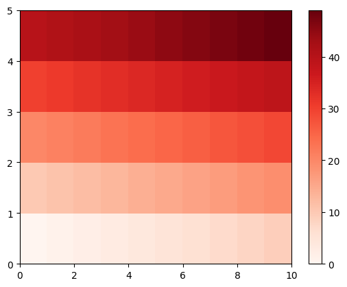
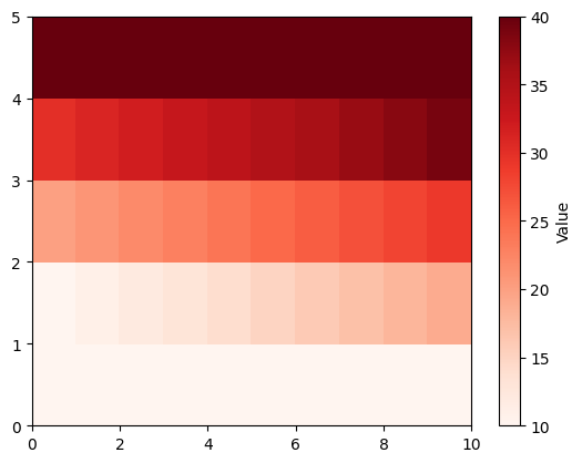
表示するカラーマップの範囲を固定したい場合、最小値と最大値をそれぞれvmin, vmaxで指定します。
カラーバーにラベルを付ける場合、plt.colorbarの戻り値を取得(以下ではcbarとしています)し、この戻り値のset_labelメソッドを使用します。
fig, ax = plt.subplots()
mappable = ax.pcolor(C, cmap="Reds", vmin=10, vmax=40)
cbar = plt.colorbar(mappable, ax=ax)
cbar.set_label('Value')
plt.show()
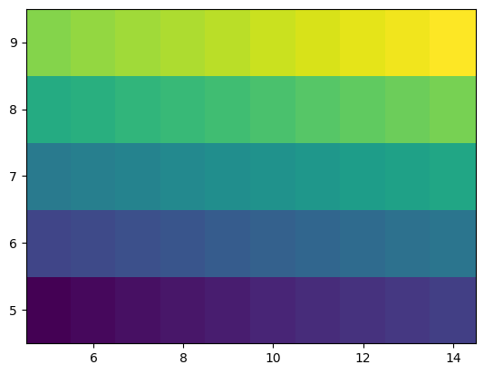
目盛りの指定#
ヒートマップの横幅と縦軸の目盛りを指定する場合、以下のようにax.pcolorの1, 2番目の引数に配列として与えます。また、shading="auto"と指定します(この指定は必須ではありませんが、省略すると警告が出ます)。
X = np.arange(5,15) # 横幅の目盛り
Y = np.arange(5,10) # 縦幅の目盛り

fig, ax = plt.subplots()
ax.pcolor(X, Y, C, shading="auto")
plt.show()
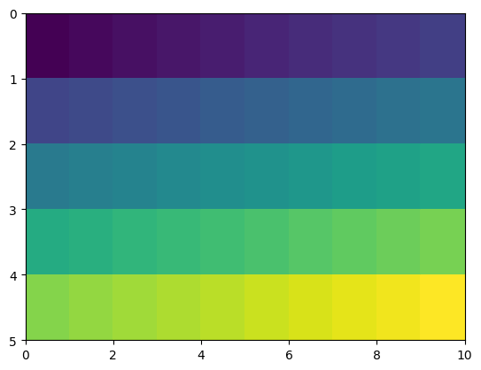
y軸の反転#
y軸の上下を反転させる場合、ax.invert_yaxis()メソッドを用います。
fig, ax = plt.subplots()
ax.pcolor(C)
ax.invert_yaxis()
plt.show()
同様にx軸の左右を反転させる場合、ax.invert_xaxis()メソッドを用います。
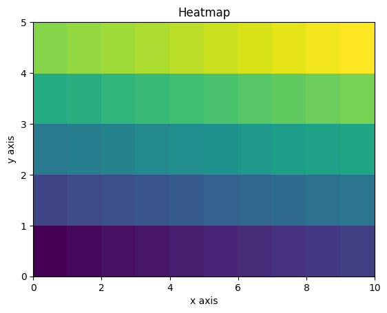
軸ラベル、タイトルの追加#
x, y軸のラベルはそれぞれax.set_xlabel, ax.set_ylabelで追加できます。また、グラフの上部にタイトルを追加する場合、ax.set_titleメソッドを使います。
fig, ax = plt.subplots()
ax.pcolor(C)
ax.set_xlabel("x axis")
ax.set_ylabel("y axis")
ax.set_title("Heatmap")
plt.show()