Matplotlibの棒グラフ#
※記事内に商品プロモーションを含むことがあります。
公開日
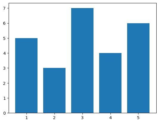
Matplotlibで棒グラフを出力するには、ax.barを使用します。ax.barの最初の引数に横軸方向の位置、2番目の引数に棒の高さをそれぞれ配列で与えます。
import numpy as np
import matplotlib.pyplot as plt

x = np.array([1, 2, 3, 4, 5]) # 横軸の値
y = np.array([5, 3, 7, 4, 6]) # 棒の高さ

fig, ax = plt.subplots()
ax.bar(x, y)
plt.show()
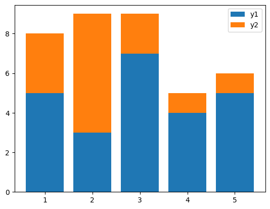
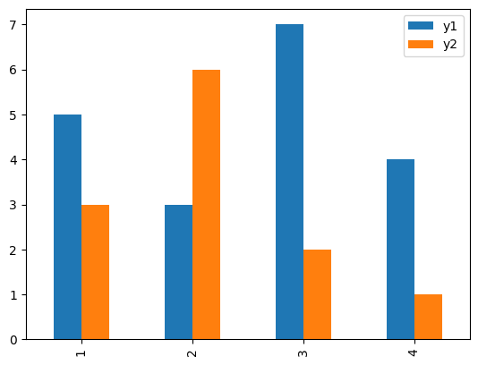
積み上げ棒グラフ#
積み上げ棒グラフを作成する場合、bottomオプションで下になるデータを指定します。
y1 = np.array([5, 3, 7, 4, 5]) # 下側のデータ
y2 = np.array([3, 6, 2, 1, 1]) # 上側のデータ

fig, ax = plt.subplots()
ax.bar(x, y1, label="y1")
ax.bar(x, y2, label="y2", bottom=y1)
ax.legend()
plt.show()
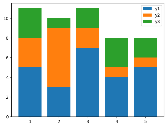
3つ以上のデータを積み上げる場合、以下のように下になるデータを合計する必要があります。
y3 = np.array([3, 1, 2, 3, 2])

fig, ax = plt.subplots()
ax.bar(x, y1, label="y1")
ax.bar(x, y2, label="y2", bottom=y1)
ax.bar(x, y3, label="y3", bottom=y1+y2)
ax.legend()
plt.show()
複数系列の棒グラフ#
複数系列の棒グラフを作成する場合、PandasのDataFrameを使うと便利です。
import pandas as pd

df = pd.DataFrame({"y1": [5, 3, 7, 4],
                   "y2": [3, 6, 2, 1]},
                  index=[1, 2, 3, 4])

df
| y1 | y2 | |
|---|---|---|
| 1 | 5 | 3 |
| 2 | 3 | 6 |
| 3 | 7 | 2 |
| 4 | 4 | 1 |
上のようなDataFrame dfに対し、plot.bar()メソッドを使用します。
fig, ax = plt.subplots()
df.plot.bar(ax=ax)
plt.show()
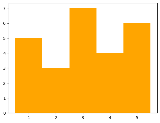
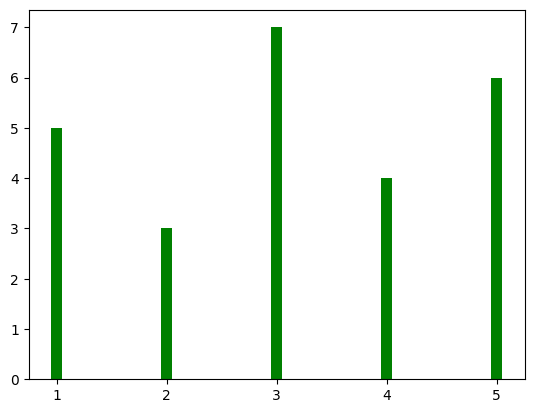
棒の太さ・色を変更する#
棒の太さはwidthオプションで指定します。1が最大(隙間なし)、0が最小となります。また、色はcolorオプションで指定します。
fig, ax = plt.subplots()
ax.bar(x, y, width=1, color="orange")
plt.show()
fig, ax = plt.subplots()
ax.bar(x, y, width=0.1, color="green")
plt.show()
colorオプションの詳細は以下の記事を参考にして下さい。
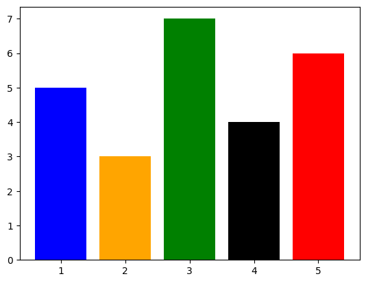
以下のようにcolorに色のリストを与えることで、棒ごとに異なる色に指定することも可能です。
fig, ax = plt.subplots()
ax.bar(x, y, color=["blue", "orange", "green", "black", "red"])
plt.show()
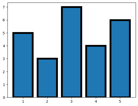
棒に枠線を付ける#
棒に枠線を付ける場合、枠線の色をedgecolor, 枠線の太さをlinewidthで指定します。
fig, ax = plt.subplots()
ax.bar(x, y, edgecolor="black", linewidth=5)
plt.show()
横軸のラベル#
横軸にラベルを付ける場合、tick_labelオプションにリストやNumPy配列などで与えます。
fig, ax = plt.subplots()
ax.bar(x, y, tick_label=["Jan.", "Feb.", "Mar.", "Apr.", "May."])
plt.show()

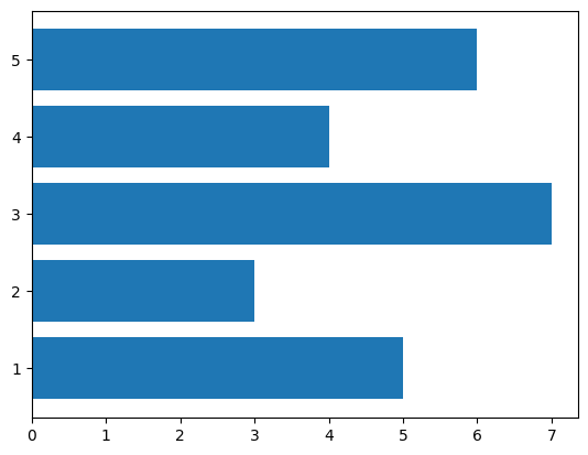
横棒グラフ#
横棒グラフを出力するには、ax.barhを使用します。ax.barhの最初の引数が縦軸方向の位置、2番目の引数が棒の長さとなります。
fig, ax = plt.subplots()
ax.barh(x, y)
plt.show()