Matplotlibの積み上げ面グラフ#
※記事内に商品プロモーションを含むことがあります。
公開日
Matplotlibで積み上げ面グラフをプロットするには、ax.stackplotを使用します。
ax.stackplotの最初の引数は横軸の値、2番目の引数は縦軸の値です。
縦軸の値を2次元配列とすると、複数系列のデータとしてプロットされます。
import matplotlib.pyplot as plt

x = [1, 2, 3]
y = [[1, 3, 2], [1, 2, 1]]

fig, ax = plt.subplots()
ax.stackplot(x, y)
plt.show()
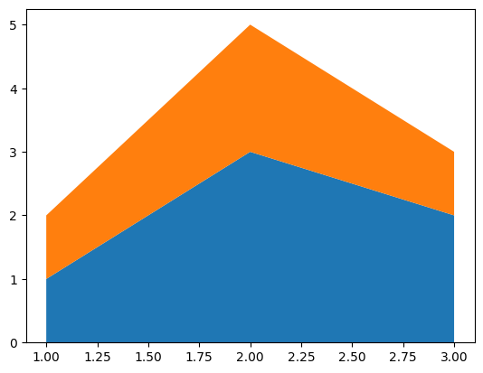
もしくは、以下のように縦軸の値を複数の引数として与えることも可能です。
x = [1, 2, 3]
y1 = [1, 3, 2]
y2 = [1, 2, 1]

fig, ax = plt.subplots()
ax.stackplot(x, y1, y2)
plt.show()
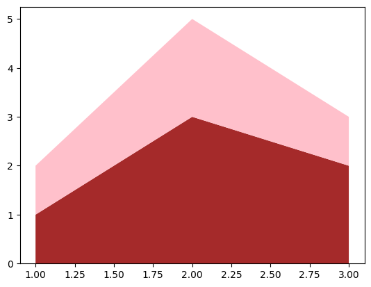
色の変更#
グラフの色を変更するには、色のリストをcolorsオプションに渡します。colorオプションの詳細は以下の記事を参考にして下さい。
fig, ax = plt.subplots()
ax.stackplot(x, y, colors=["brown", "pink"])
plt.show()
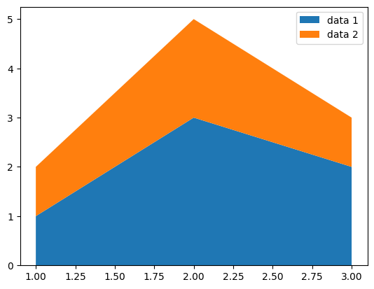
データのラベル#
ax.stackplotのlabelsオプションにデータのラベルを配列で与えることができます。ラベルを凡例として表示するには、ax.legend()を追加します。ax.legend()の詳細については以下の記事を参照ください。
fig, ax = plt.subplots()
ax.stackplot(x, y, labels=["data 1", "data 2"])
ax.legend()
plt.show()