Matplotlibの散布図#
※記事内に商品プロモーションを含むことがあります。
公開日
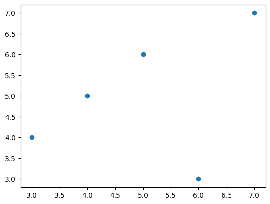
Matplotlibで散布図を出力するには、ax.scatterを使用します。ax.scatterの最初の引数に横軸方向の値、2番目の引数に縦軸方向の値をそれぞれ配列で与えます。
import numpy as np
import matplotlib.pyplot as plt

x = np.array([4, 6, 7, 3, 5]) # 横軸の値
y = np.array([5, 3, 7, 4, 6]) # 縦軸の値

fig, ax = plt.subplots()
ax.scatter(x, y)
plt.show()
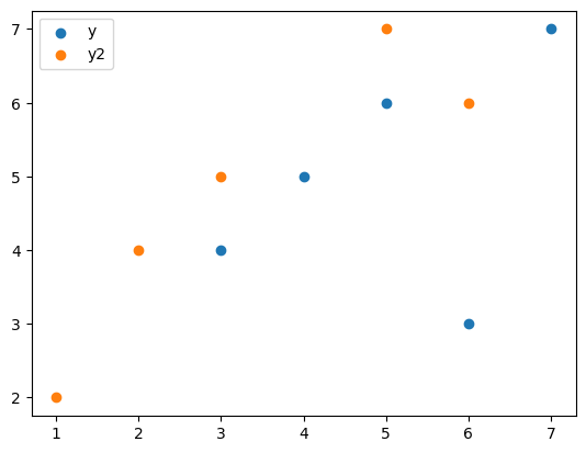
複数系列の散布図#
散布図に系列を追加したい場合、以下のようにax.plotを追加します。labelオプションとax.legend()を使うことで、系列名を凡例として表示できます。
x2 = np.array([1, 3, 2, 5, 6]) # 横軸の値
y2 = np.array([2, 5, 4, 7, 6]) # 縦軸の値

fig, ax = plt.subplots()
ax.scatter(x, y, label="y")
ax.scatter(x2, y2, label="y2")
ax.legend()
plt.show()
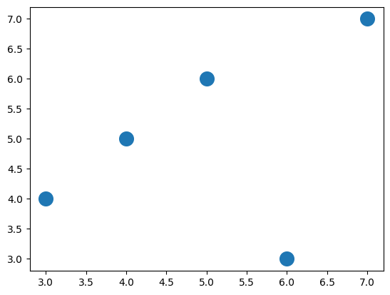
マーカーの大きさ・色・種類を変更する#
マーカーの大きさはsオプションで指定します。
fig, ax = plt.subplots()
ax.scatter(x, y, s=200)
plt.show()
マーカーの色はcオプションで指定します。cオプションの詳細は以下の記事を参考にして下さい。
fig, ax = plt.subplots()
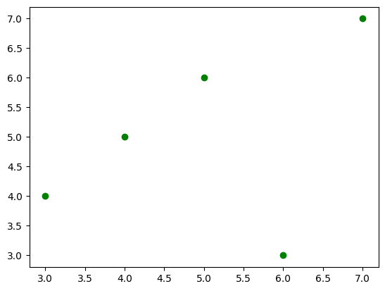
ax.scatter(x, y, c="green")
plt.show()
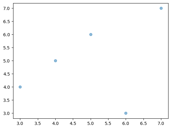
また、alphaオプションで透明度を変更できます。0から1の範囲を取り、値が小さいほど透明に近づきます。
fig, ax = plt.subplots()
ax.scatter(x, y, alpha=0.5)
plt.show()
マーカーの種類はmarkerオプションで指定します。
fig, ax = plt.subplots()
ax.scatter(x, y, marker="o")
ax.scatter(x, 0.8*y, marker="v")
ax.scatter(x, 0.6*y, marker="s")
ax.scatter(x, 0.4*y, marker="+")
ax.scatter(x, 0.2*y, marker="o")
ax.scatter(x, 0*y, marker="D")
plt.show()
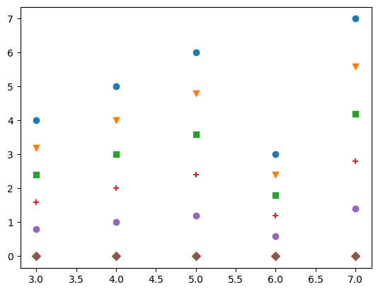
主なmarkerオプションを以下の表に示します。
marker |
説明 |
|---|---|
|
丸 |
|
下向き三角 |
|
上向き三角 |
|
左向き三角 |
|
右向き三角 |
|
四角形(square) |
|
五角形(pentagon) |
|
+記号 |
|
x記号 |
|
ダイヤモンド |
その他に利用可能なマーカーの種類は、以下の公式ページを参照してください。
matplotlib.markers — Matplotlib documentation
マーカーの枠線の太さ・色などは変更できます。指定できるオプションを以下の表に示します。
オプション |
説明 |
|---|---|
linewidths |
マーカー枠線の太さ |
edgecolors |
マーカー枠線の色 |
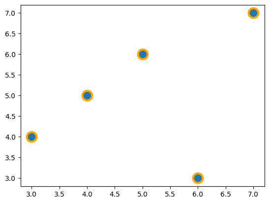
これらのオプションを使用した例を以下に示します。マーカーの枠線の色はオレンジ、枠線の太さは3となります。
fig, ax = plt.subplots()
ax.scatter(x, y, s=200, edgecolors="orange", linewidths=3)
plt.show()
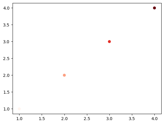
カラーマップの指定#
散布図の各点の色を、値に合わせて指定できます。cに値を、cmapにカラーマップを指定します。
x1 = np.array([1, 2, 3, 4]) # 横軸の値
y1 = np.array([1, 2, 3, 4]) # 縦軸の値
v1 = np.array([1, 2, 3, 4]) # 点の色に対応する値

fig, ax = plt.subplots()
ax.scatter(x1, y1, c=v1, cmap="Reds")
plt.show()
指定可能なカラーマップについては、以下のページも参照下さい。
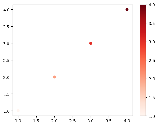
カラーバーを表示する場合、plt.colorbarを使用します。ax.scatterの戻り値はPathCollectionというクラスのオブジェクトです。これをplt.colorbarの最初の引数とします。また、axオプションにカラーバーを表示するグラフ(ここではax)を指定します。
fig, ax = plt.subplots()
mappable = ax.scatter(x1, y1, c=v1, cmap="Reds")
plt.colorbar(mappable, ax=ax)
plt.show()
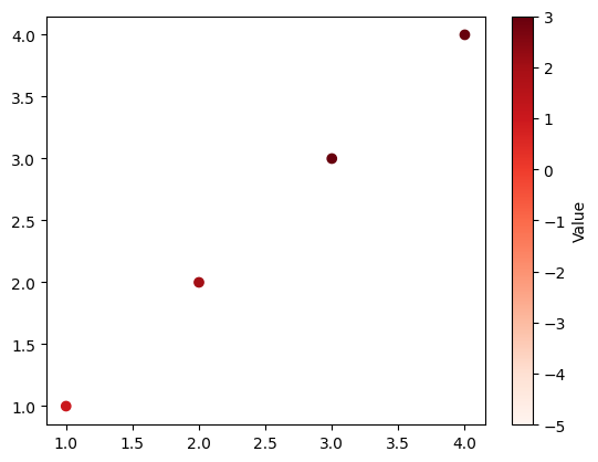
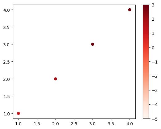
また、表示するカラーマップの範囲を固定したい場合、最小値と最大値をそれぞれvmin, vmaxで指定します。
fig, ax = plt.subplots()
mappable = ax.scatter(x1, y1, c=v1, cmap="Reds", vmin=-5, vmax=3)
plt.colorbar(mappable, ax=ax)
plt.show()
以下にカラーバーにラベルを付けるコードを示します。plt.colorbarの戻り値はColorbarというクラスのオブジェクトです(以下ではcbarとしています)。このオブジェクトのset_labelメソッドを使用します。
fig, ax = plt.subplots()
mappable = ax.scatter(x1, y1, c=v1, cmap="Reds", vmin=-5, vmax=3)
cbar = plt.colorbar(mappable, ax=ax)
cbar.set_label('Value')
plt.show()